Build a responsive CSS Grid sidebar that stacks on phones

A walking guide needs room for a list of walks beside the route description. On a phone, people should be able to read the description without scrolling sideways. You can build both layouts in Phoenix’s free CSS Grid Generator and download a single HTML file that switches between them.
You’ll make three blocks called Trail notes, Walks, and Route details. All you need is a browser.
Set up the sidebar
- Open the CSS Grid Generator. At the top of the builder, choose Sidebar. The first block stretches across the top. The two below it share a row.
- Under Selected item, choose Item 1. Change Label to
Trail notesand press Tab. Repeat with Item 2 forWalksand Item 3 forRoute details. On a phone, open Layout controls to see these fields. - Under Layout, keep Stack on small screens checked. Beside Live preview, open the width menu and choose Desktop · 960px. On a phone, tap Preview & code first.
The preset uses four equal columns. The heading spans all four. Below it, Walks takes the first column and Route details takes the other three.
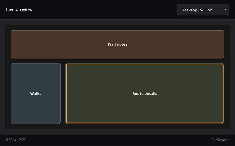
Check what happens on a phone
Choose Mobile · 375px from the same menu. Stacked layout appears under the preview. Read from the top down and you should see Trail notes, Walks, then Route details. Each takes the full width available inside the page margins.
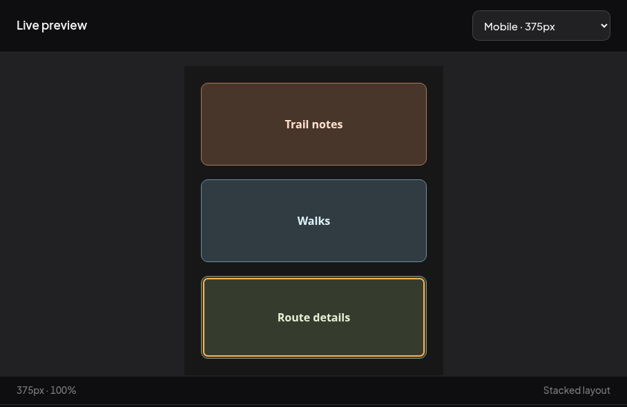
Save and try the finished page
- Click Download HTML below the code. Open the downloaded
phoenix-grid.htmlin your browser. - Make the window narrow, then wide again. The exported CSS uses
@media (max-width: 640px). At 640 CSS pixels and below you get one column. Above that width the sidebar and content sit side by side. - To use the layout for your own page, open the downloaded file in your editor and find
Route detailsinside<body>. Replace that label with a route description, save, and reload the browser. Keep the three blocks in the order you want people to read them on a phone. The small-screen layout follows their order in the HTML.
If your own content sticks out past the right edge after the columns stack, check whether an item inside the grid has a fixed width. Test a page at different screen sizes.