How to Test Your Website on Different Screen Sizes

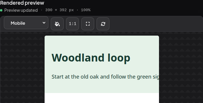
The Woodland loop card below fits on a laptop and a tablet. On a phone, the distance disappears off the right edge. Try the three screen widths in the free Phoenix HTML Viewer, then add one line of CSS to bring 2 miles back into view.
Open the same page at three widths
- Open the Phoenix HTML Viewer. Paste the whole example below into HTML source, replacing any text already there. If you see separate Source and Preview tabs, paste into Source and switch to Preview.
- Under Rendered preview, open the screen-width menu. It initially reads Responsive. Select Desktop, then Tablet, then Mobile. Look for 2 miles on the right of the green card each time.
<!doctype html>
<html lang="en">
<head>
  <meta name="viewport" content="width=device-width, initial-scale=1">
  <title>Weekend walks</title>
  <style>
    body { margin: 0; font: 18px/1.5 system-ui, sans-serif; }
    .walk {
      box-sizing: border-box;
      width: 720px;
      padding: 24px;
      color: #173c32;
      background: #e5f2e8;
    }
    .distance { float: right; }
  </style>
</head>
<body>
  <main class="walk">
    <strong class="distance">2 miles</strong>
    <h1>Woodland loop</h1>
    <p>Start at the old oak and follow the green signs.</p>
  </main>
</body>
</html>
| Viewport preset | What you should see |
|---|---|
| Desktop, 1280 pixels | The full green card and some white space to its right. |
| Tablet, 768 pixels | The full card, with a much smaller gap on the right. |
| Mobile, 390 pixels | The heading is visible. You have to scroll sideways inside the preview to reach 2 miles. |
Fix the card and test again
In HTML source, find width: 720px; inside the .walk rule. Keep that line and add the following one immediately below it.
max-width: 100%;
Switch back to Preview if needed. At Mobile, the distance and heading should now be visible together. The description wraps to a second line. Switch back to Tablet and Desktop. The card still stops at 720 pixels on those wider screens.
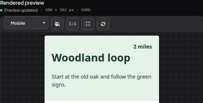
The card needed 720 pixels even when its parent had only 390. The new maximum lets it shrink to the available width. The existing box-sizing: border-box keeps the padding inside that width. On your own page, apply the change to the element that sticks out, save the stylesheet, and repeat the same width checks. How CSS max-width works
Test a project with separate files
If your HTML links to a local stylesheet or images, open the whole project in Phoenix Code so Live Preview can find those files. In Phoenix Pro, the device-size button at the right of the Live Preview toolbar lets you switch widths. After checking the layout, open your published page on a real phone to try the links, touch controls, and on-screen keyboard. Device Preview in Phoenix Pro · Troubleshoot missing styles and images