Put an image next to text in Phoenix Code
To put an image beside text in Phoenix Code, set their shared container to Flex. A container is the HTML element around both items.
- Phoenix Pro: select the container in Live Preview and use the Layout controls.
- Community (free): add four layout settings to your CSS file.
The practice project below includes the photo and HTML. You'll change the layout, then check that the photo and text sit side by side on a wide screen and stack on a phone.
1. Open the practice project
- Download the image and text practice project.
- Extract the ZIP. On Windows, right-click it and choose Extract All. On macOS, double-click it. On Linux, use your file manager's Extract option.
- In Phoenix Code, click the folder with a plus at the top left. Choose Open Folder…, then select the extracted
image-text-layoutfolder. - Open
index.htmlfrom the file list. If Live Preview is closed, click the lightning bolt on the right. - If you're asked, choose Trust & Execute Preview for this practice project.
The folder contains index.html, styles.css, and images/woodland.jpg. In the preview, look for “Plan a woodland walk” and the woodland photo.
To open the practice folder, use the desktop app or the web app in Chrome or Edge. See Open Folder for more help.
2. Put the photo and text in a row
Choose your edition below. Both use the .feature container around the photo and text.
- Phoenix Pro
- Community (free)
Select the shared container
- Click the maximize icon in the preview toolbar to enter Design Mode. The preview will fill the workspace.
- Click the pen button if it's gray. An orange pen means Edit Mode is on.
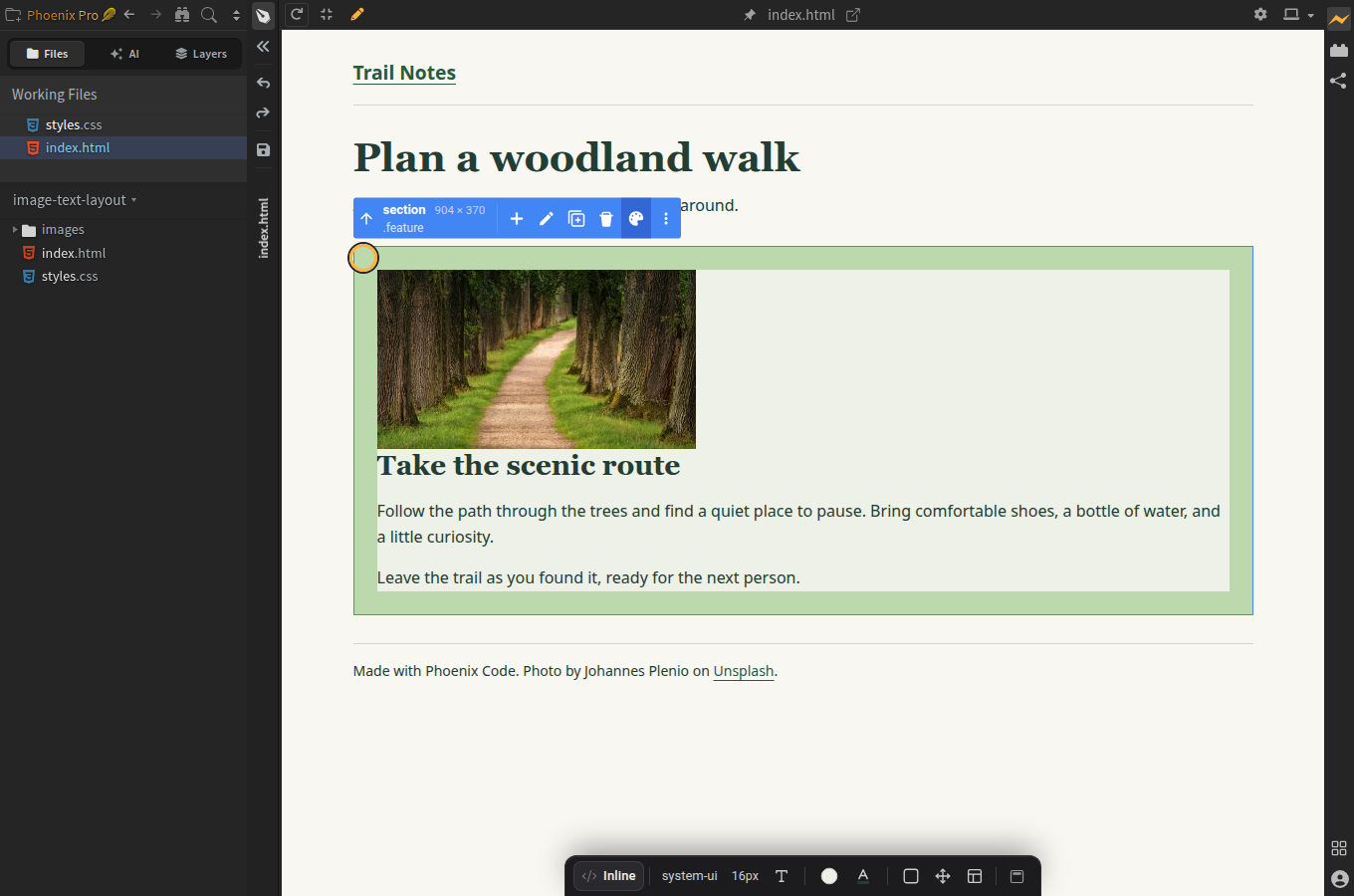
- Click an empty part of the pale green area around the photo and text. The blue selection box should surround both the photo and the text. Look for section and .feature in the floating toolbar.
If the blue outline surrounds only the photo, click the empty pale green space beside it to select the whole .feature container.
Set the layout
Keep Save changes to set to Inline (the default). Pro will save these settings in the selected section of index.html.
- Click Layout in the Styles Bar. Look for the rectangle divided into smaller boxes. Hover over it to see Layout – Block.
- In the Display tab, change Block to Flex. Leave Direction as Row (the arrow pointing right).
- Under Placement, choose the middle-left dot (the tooltip is Center / Left). This keeps the row on the left and centers the photo and text vertically.
- Change Wrap from No Wrap to Wrap. This lets the text move below the photo on narrow screens.
- Set Gap to 24 and leave the unit as px. Press Enter to apply it.
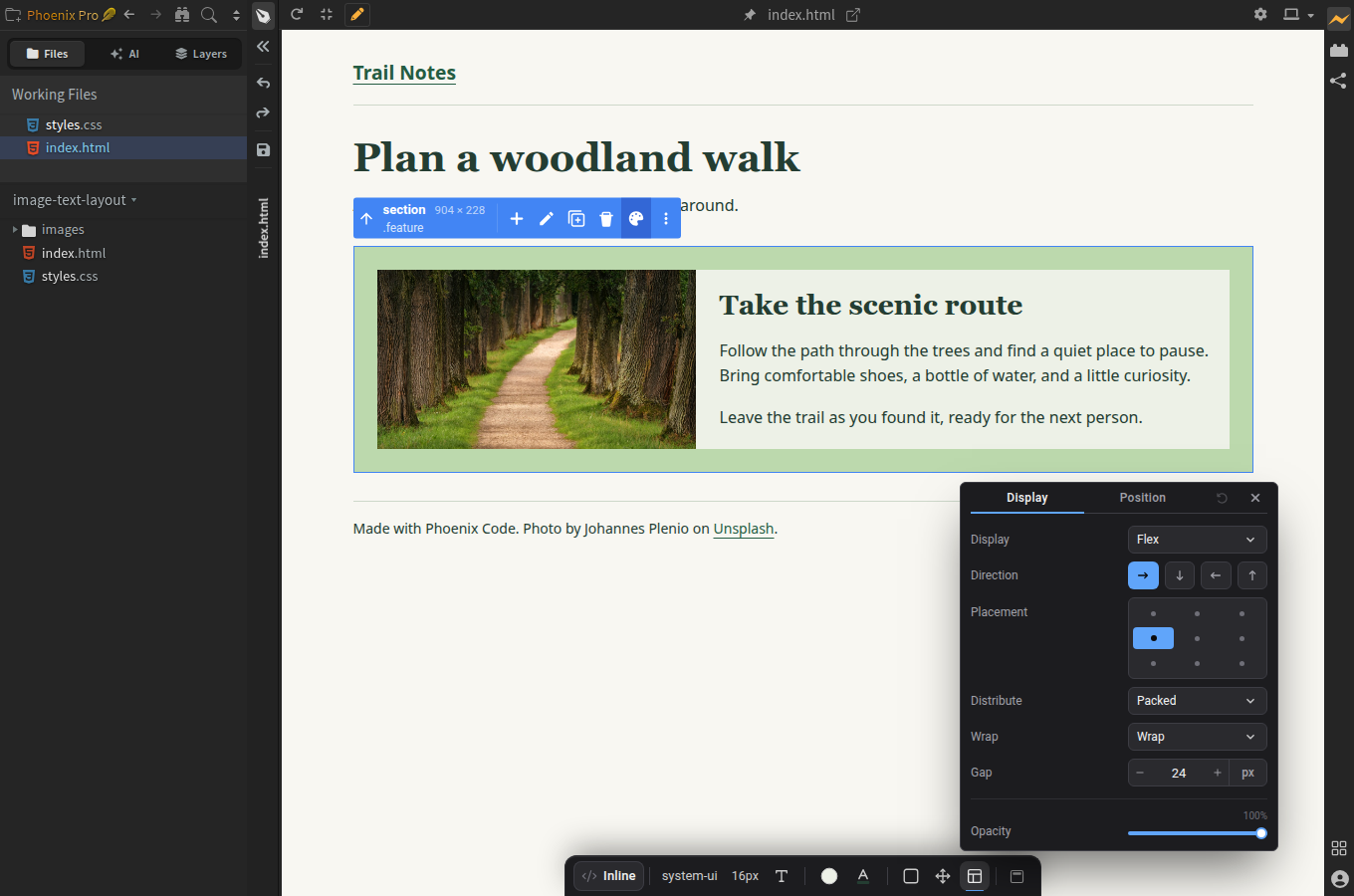
Close the panel with its X. Keep index.html selected and click the floppy-disk icon next to the file list to save your changes. Hover over it to see Save File. You can stay in Design Mode.
Watch the steps
The video starts with the project open in Design Mode and Edit Mode on. Follow along as we select the container, change the layout, and check the result.
Find the shared container
Keep the code editor and Live Preview side by side. If the editor is hidden, click the restore icon in the preview toolbar.
In index.html, find the section with class="feature". Inside it are the image (<img>) and a <div class="feature-text"> holding the heading and paragraphs:
<section class="feature" aria-label="Walk suggestion">
  <img src="images/woodland.jpg"
       alt="A sunlit path between tall trees"
       width="1200" height="675">
  <div class="feature-text">
    <h2>Take the scenic route</h2>
    <p>Your text goes here.</p>
  </div>
</section>
This HTML is already in the practice project. The example above uses shorter text so you can see the structure.
Add four CSS settings
If you've already done the Pro steps, extract a fresh copy of the practice project. The Pro settings saved in index.html take priority over the CSS below, so start with the original files.
- Open
styles.cssfrom the file list. - Find the
.featurerule, just below the comment “Add your layout settings inside this rule”. - Keep the
paddingandbackgroundlines. Add the four highlighted lines between the same opening{and closing}:
.feature {
  padding: 24px;
  background: #edf1e7;
  display: flex;
  flex-wrap: wrap;
  align-items: center;
  gap: 24px;
}
- Save with Ctrl+S on Windows/Linux or Cmd+S on macOS. Check Live Preview: the text should now sit next to the photo when there's enough room.
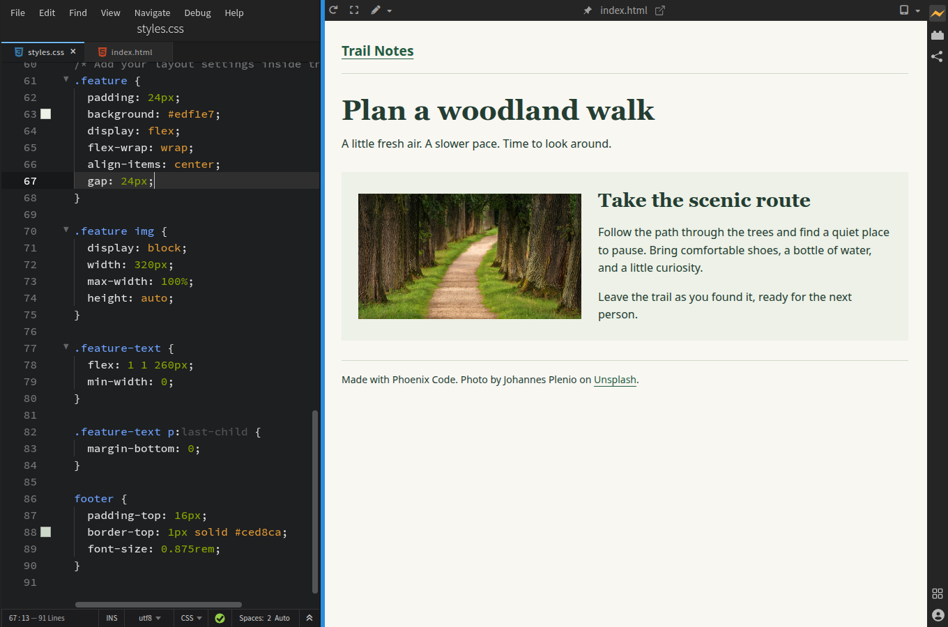
display: flexputs the photo and text side by side.flex-wrap: wraplets the text move below the photo when there isn't enough room.align-items: centerkeeps the photo and text centered vertically.gap: 24pxadds 24 pixels of space between them.
The practice project already sets the photo's width and lets the text fill the space beside it.
3. Check the result at two sizes
In Pro, turn off the pen button to see the finished page without selection outlines.
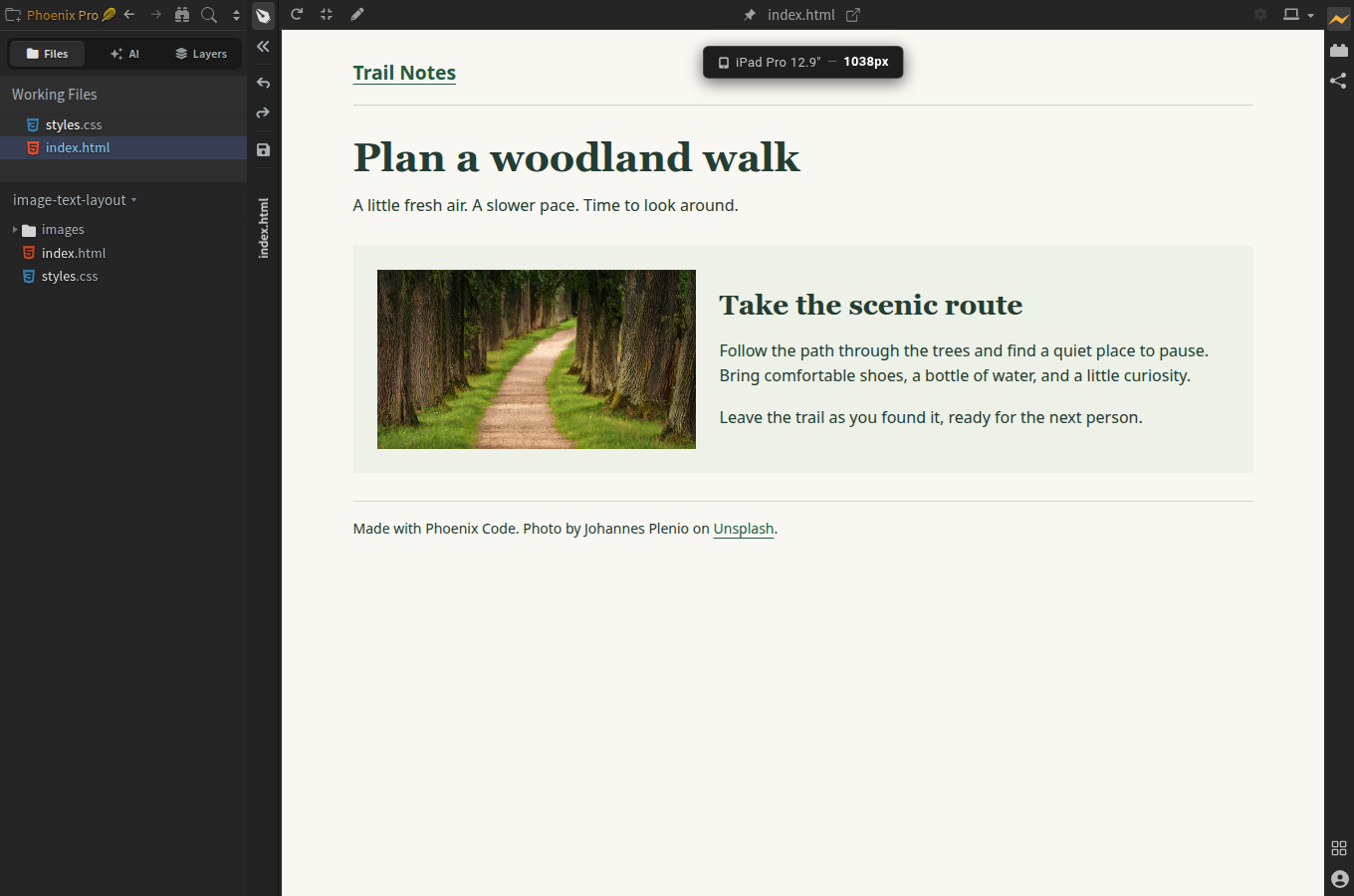
- Wide preview: photo on the left, text on the right, with a gap between them.
- Phone preview: click the small down arrow next to the device icon in the preview toolbar. Select iPhone 14 (390px) or another phone width. The text should sit below the photo, with no need to scroll left or right. Select Fit to screen to return to the full preview width.
Use the layout on your own page
On your own page, put the image and a text <div> inside the same <section> or <div>. Apply Flex to the outer element using the steps for your edition above. Keep the heading and paragraphs inside the text element so they move together.
To use the CSS below, give the outer element class="feature" and the text element class="feature-text", as in the HTML example. Add these settings to your stylesheet below the .feature rule so the image and text fit both wide and narrow screens:
.feature img {
  display: block;
  width: 320px;
  max-width: 100%;
  height: auto;
}

.feature-text {
  flex: 1 1 260px;
  min-width: 0;
}
The photo is 320px wide but can shrink to fit its container. The text uses 260px as a starting width and grows to fill the space beside the photo. Change these two sizes to suit your content.
Need a different picture? Follow Add an image to your website. For more controls, see the Styles Bar Layout guide or MDN's introduction to Flexbox.
Frequently asked questions
Why is the text still below the image?
Check that Flex is set on the container holding both the image and the text. In Community, make sure you've saved styles.css and linked it from index.html. On a narrow screen, the text should be below the photo. Widen the preview or choose Fit to screen to see the row.
Can I put two images side by side instead?
Yes. Put both <img> elements directly inside the same container and apply the same Flex, Wrap, and Gap settings to it. Set the image widths so both fit in the row. Keep Wrap on so one image can go below the other on smaller screens.
Do I need Phoenix Pro for Flexbox?
No. Flexbox works in both editions. In Pro, use the Layout controls. In Community, edit the CSS and check your changes in Live Preview.